Idle Miner Tycoon Wearing A Snorkel
This is Idle Miner Tycoon with the elevator shaft flooded. Same vertical decks, same UPGRADE and RECRUIT buttons on every row, same warehouse pickup loop, just with a yellow submarine instead of a mine cart. That would be forgivable if the page argued why the ocean changes anything, but nothing does: 'Deck 1 Coal, Deck 2 Copper, Deck 3 Iron' is literally a land mine with bubbles drawn over it. The only genuinely fresh idea on this whole page is buried in a tooltip in screenshot four that says 'No predators on this deck', and the store copy never mentions predators once.
FREE ADVICE
Lead with whatever is unique to being underwater: predators, oxygen, pressure, the Hard Rock Layer. Put that mechanic in the first sentence of the short description and dedicate one screenshot to it.
You Wrote It Once And Pasted It Twice
The short description and the About section are the same paragraph with the words shuffled. Both open with 'Dive into the depths of the ocean.' Both list 'drilling rigs, hire divers, submarines, decks, skill tree.' A shopper reads your pitch, scrolls down for more detail, and gets the identical pitch again in a slightly different order. Meanwhile the actual selling points are missing: no offline earnings, no prestige, even though your own skill tree screenshot has a 'NEW RUN starts with 10 gold' button, no numbers, no idea how deep the decks go. 'Find optimal growth strategies' is not a feature, it is a shrug.
FREE ADVICE
Rewrite the About section with subheads for each loop beat: Drill and Collect, Recruit and Automate, Prestige and Skill Tree, Survive the Depths. Put one concrete number under each, like the deck count and offline earning cap.
Two Menus In Your Hover Preview
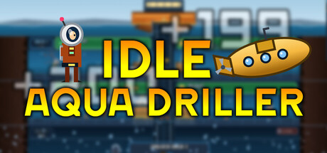
The pixel art itself is clean and the neon deck view actually reads well, which is the one compliment available here. Then you spend the hover tooltip on it: shot two is a skill tree floating on a near black void with icons too small to identify, and shot four is a spreadsheet modal listing Void Reaver and Nebula Eater at 5M and 125M. Shots one and three are the same screen at different scroll depths. So the first four images are one environment, one empty background, and one list. The capsule is a screenshot with giant yellow text slapped across it, and the '+199' popup is half hidden behind the letter D, which is a small thing that screams that nobody composed this image.
FREE ADVICE
Replace screenshots two and four with distinct gameplay moments: a deep bioluminescent deck and a predator or event interrupting production. Redraw the capsule as a single hero submarine over the deck shaft with the title clear of any art.
THE POSITIONING
DEVASTATINGCharging For The Free Mobile Game
Your anchor is Idle Miner Tycoon, and every shopper who has touched a phone in the last eight years will recognize it instantly from screenshot one. That means your entire pitch has to be 'the same loop but premium, no ads, no timers, no gem shop', and the page never says any of that. Instead you ask $3.50 for something that looks free, with Mostly Negative reviews at 3 positive out of 8 sitting right at the top of the page. And a listed release date of Jul 1, 2026 on a game that already has eleven reviews reads as a page nobody is maintaining.
FREE ADVICE
State the premium promise explicitly in the short description: no ads, no timers, no microtransactions, buy once. Then fix the release date field so it matches reality.
Eight Angry People Standing At Your Door
The only call to action a shopper sees is a Mostly Negative rating and a $3.50 price with no discount, no demo, and no developer reply in sight. At this price the impulse buy is your entire business model, and a red review bar kills impulse buys faster than any copy problem. There is no roadmap, no 'what we fixed' section, nothing that tells a browsing player this is a game in active development rather than an abandoned mobile port.
FREE ADVICE
Add a demo and a dated update log at the top of the About section listing the specific fixes made since the negative reviews landed.
Competent Clone, Neglected Shopfront
There is a real game here. The deck view has personality, the numbers scale into the billions, the pixel submarines are cute. But the page treats all of that as an afterthought: duplicated copy, two menus in the hover preview, a capsule that is a screenshot with text on it, and a rating that is currently doing your marketing for you in the worst possible way. Nothing on this page tells a stranger why they should pay for this instead of installing the free one on their phone.
FREE ADVICE
Spend one weekend on the storefront only: new capsule, rewritten About with subheads, four gameplay screenshots covering four different depths, and an explicit no ads no timers promise.
FINAL VERDICT
You built an idle miner, dropped it in the ocean, and then described it twice in the same words while your hover preview showed shoppers a skill tree on a black screen. The Mostly Negative bar closes the sale before your copy ever gets a chance to open it. The ray of hope: the art is genuinely charming and the deck screenshot reads clearly at thumbnail size, which means a new capsule, four real gameplay shots, and an honest 'no ads, no timers' promise could turn this from ignored to browsed inside a week.